In the competitive real estate landscape, a strong and distinctive visual corporate identity remains memorable. Achieving this requires a carefully considered and nurtured visual identity along with cutting-edge communication. With our clarified core messages and brand identity, we are boldly a step ahead according to our values.
Brand identity supporting our core messages
Real estate investment management, construction management and living– Premico’s services cover the entire lifecycle of real estate development life cycle. We have been providing rental housing services since 1963, and it felt like the right time to examine the core messages on the threshold of our 60th anniversary.
We worked on refining our core messages together with the skilled team at Avidly at the turn of the year. Pioneering spirit, responsibility, collective success, and the spirit of Premico – these are the aspects through which we aim to be recognized in the real estate industry. Subsequently, we identified the need to update our brand identity to support these messages.
Our goal in our brand work was to ensure that our sales materials, proposal templates, and presentation graphics consistently communicate the essence of being part of Premico. Simultaneously, these materials needed to be user-friendly yet tailored to diverse needs.
Kakadu was chosen as our partner in shaping our corporate identity. Their proficient team had become familiar to us through the earlier Premico Green collaboration.
“The Kakadu team seemed to understand well what Premico is about and what visual identity supports the Premico brand,” says Essi Stolt, Premicon’s Employee Experience Manager.
The Kakadu team gathered all the current elements of Premico’s communication on their desk. We engaged in open discussions with them about which messages and distinctive features best align with the desired brand image. Based on these discussions, we received proposals for a new color palette, imagery, and graphic elements.
Blending the New and the Old for a Sustainable, Contemporary, and Economical Outcome
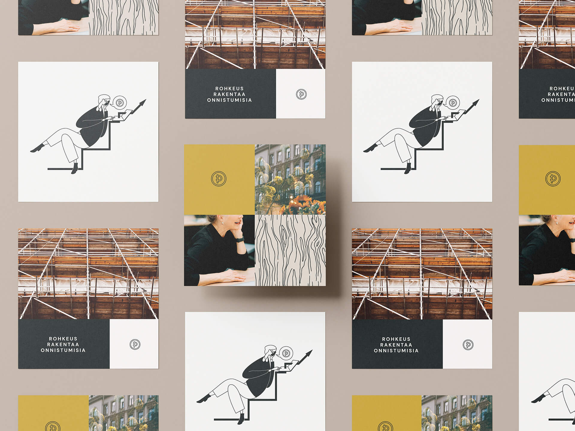
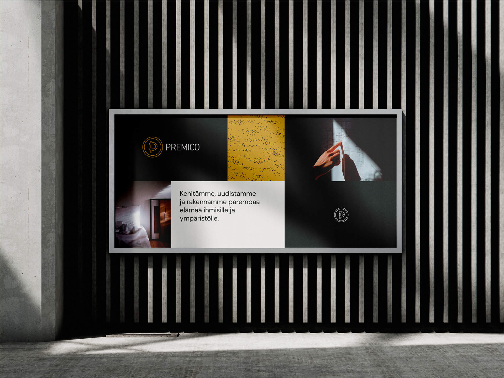
At the core of our brand identity is the concept of softness and human connection expertly intertwined with solid expertise. Dark yet warm colors, photographs reflecting our industries, and an approachable font create a recognizable visual whole. As a new addition, illustrations crafted by Kakadu’s illustrator, Ilona Partanen, were introduced into the identity. Custom textures and characters tailored for Premico make the identity distinctive and unique.
Our brand work serves as an excellent example of how blending the new and the old can achieve a sustainable, contemporary, and economical result; our identity was built partly using a set of old, proven elements. For instance, our logo underwent only a subtle color update. This ensured that we stayed within budget and timeline constraints without compromising on the end result.
In the competitive real estate landscape, a strong and distinctive visual corporate identity remains memorable. Achieving this requires a carefully considered and nurtured visual identity along with cutting-edge communication. With our clarified core messages and brand identity, we are boldly a step ahead according to our values.
“Kakadu’s Art Director, Saara Majanne, captivated us with her listening skills. She grasped our wishes excellently, and from the first round of feedback, we felt the project was safely progressing toward the desired outcome,’ summarizes our HR Director, Maija Kauppinen.”
Images by Kakadu Oy